We redesigned a child health insurance sales page with nudges to increase the conversion rate and online sales.
A leading insurer in health, accident, and auto insurance launched a new children's insurance plan that could be purchased online in just a few steps. Despite its ease and accessibility, sales weren't meeting expectations.
The challenge was to optimize the product's main page design with behavioral science insights to increase the conversion rate and sales.
A key barrier: it's hard to gauge the value of insuring a child for $10 a month, because there's no frame of reference. There's no intuitive way to know whether that's a fair or reasonable price.
After reviewing the scientific evidence, we designed 12 behavioral interventions (nudges) to influence the purchase decision. Together with the client, we evaluated and prioritized them down to two, based on their potential for behavior change and ease of implementation. We then tested them with real users.
Review of scientific evidence and design of 12 nudges to influence the insurance purchase decision.
Evaluation and prioritization of the alternatives down to two nudges: Pennies-A-Day and Anchoring.
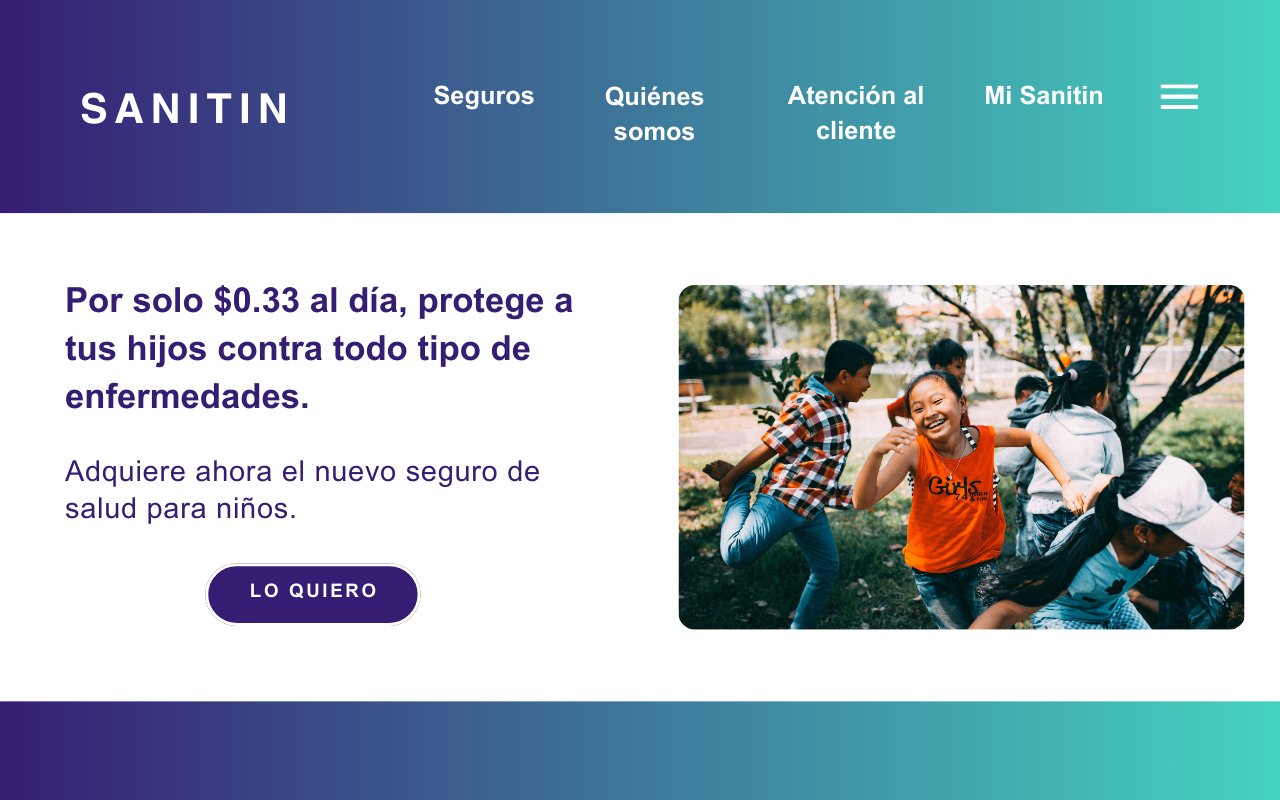
Landing page message: "For just $0.33 a day, protect your kids against all kinds of illness."
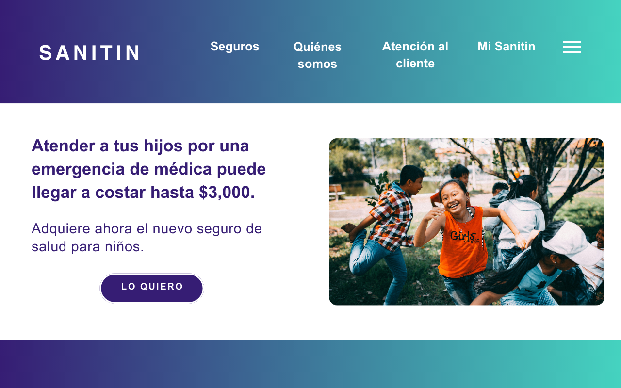
Landing page message: "Treating your kids for a medical emergency can cost up to $3,000." This was the winning strategy.
A real experiment to measure the effect of each version on the conversion rate and sales, against the status quo version.
When something isn't selling, the typical reaction is to rewrite the copy until it sounds better. Behavioral Design starts earlier: it identifies the behavioral barrier (here, that no one knew if $10 a month was a fair price, because there was nothing to compare it to) and picks the lever that tackles it, from an evidence-based toolkit.
Then it tests it with real users. That's how the team knew which lever worked, and by how much, before scaling it.
Rewriting the copy is easy and usually a shot in the dark. Choosing the lever with evidence and testing it is what multiplied sales.
We reviewed the scientific evidence and designed 12 nudges for the purchase decision. Together with the client, we prioritized them by potential impact and ease of implementation down to two: Pennies-A-Day ("for $0.33 a day") and Anchoring ("an emergency can cost up to $3,000"). We tested them with real users against the status quo version and measured each one's effect on conversion and sales. Anchoring, which gave people a concrete reference point, moved the needle the most.
Figure · The versions we tested (price framing)
The Anchoring nudge turned out to be the most effective: giving a concrete reference point for the cost of a medical emergency multiplied sales fivefold. The Pennies-A-Day version also increased them, with effects that varied across cases. Overall, the pages with nudges converted better than the status quo version.
Applying behavioral science to the design of messages and web pages is an effective, cost-efficient way to increase online sales.
The results show strong potential for implementing other behavior-change strategies in the future, further optimizing the effectiveness of digital marketing campaigns.